UX/UI Audit
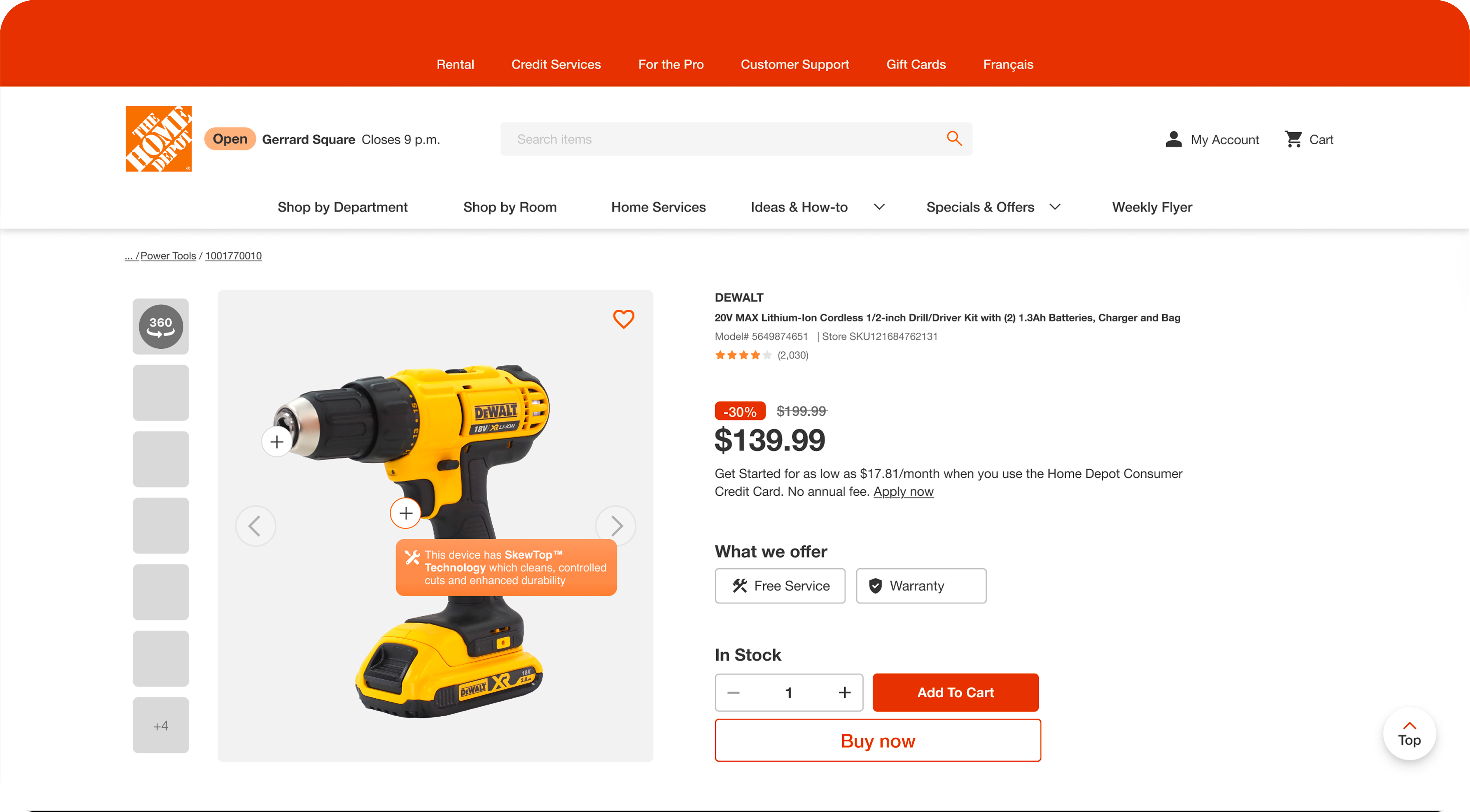
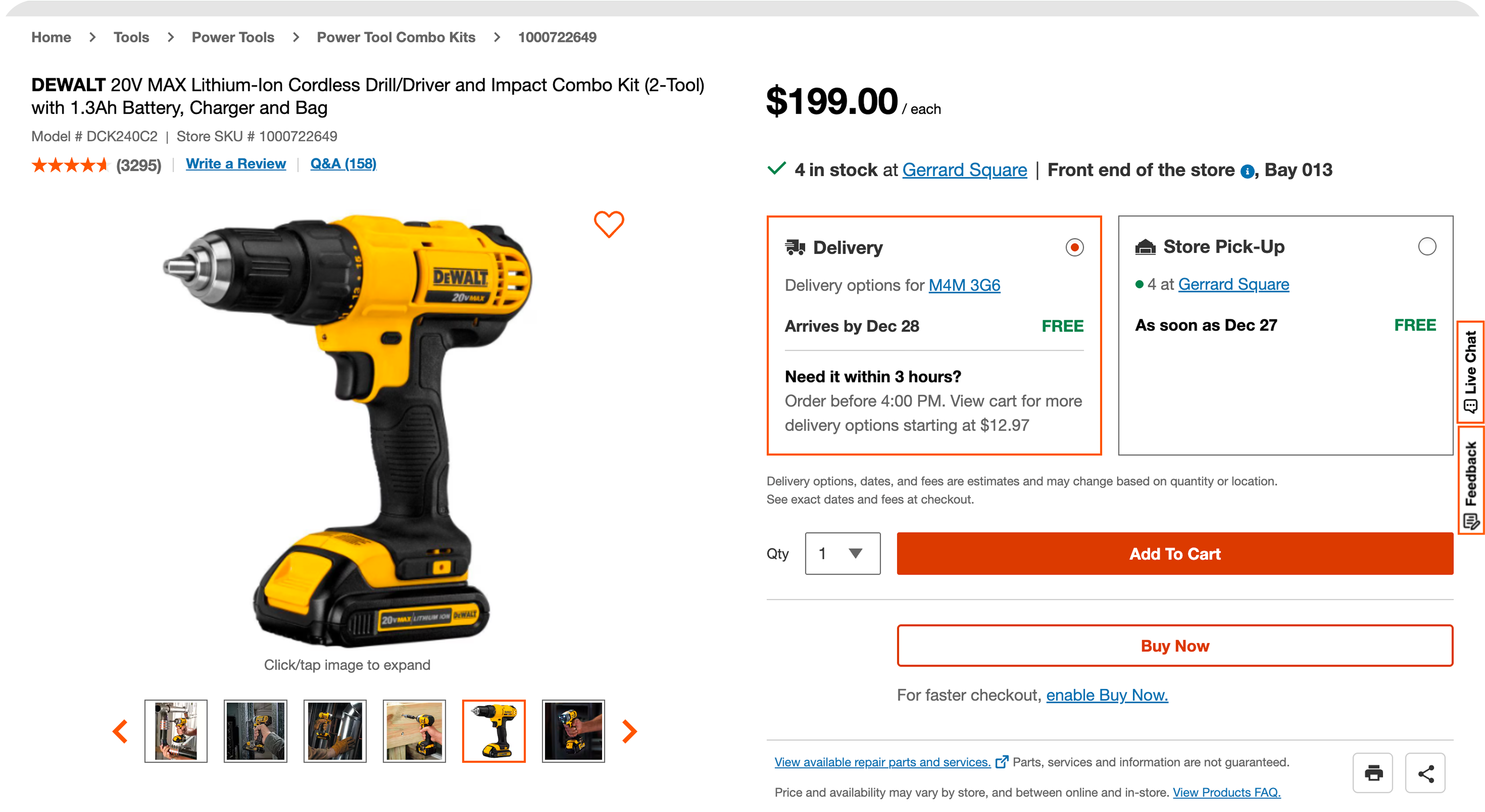
Attention analysis showed a misalignment between visual hierarchy and user decision-making.
Especially for line items where users preferred a more automated purchase decision: product titles and delivery details drew more focus than price and primary actions, yet the interface wasn't guiding accordingly.
Additionally, overlooked secondary actions—such as connectivity, delivery information, and bundle pricing—caused users to miss important product options.
Straightening visual cues and feedback patterns established clearer pathways—reducing hesitation and making for a more intuitive browsing experience.